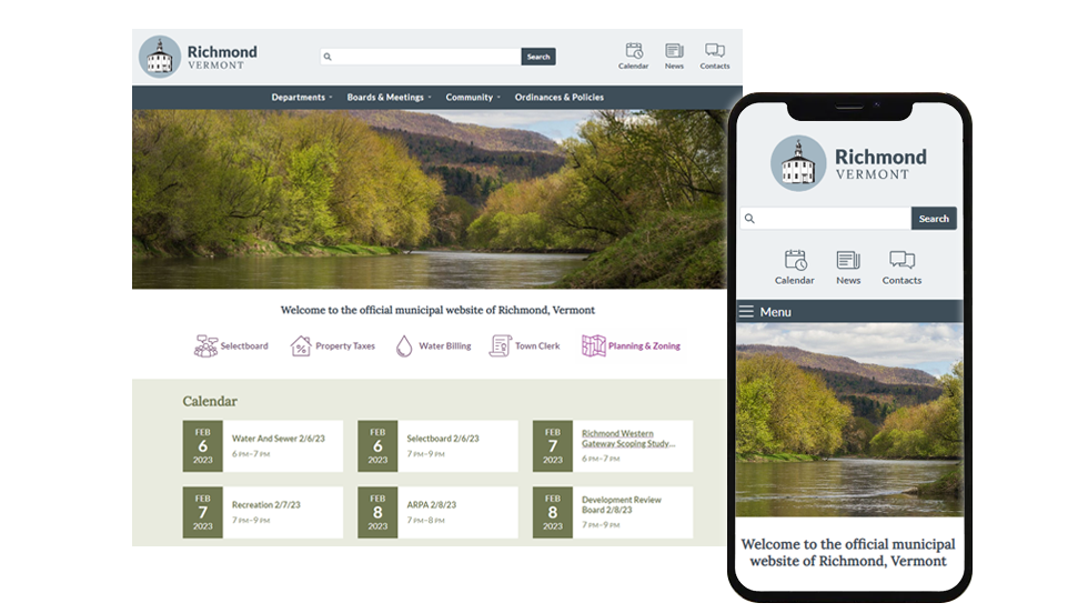
Mobile-Friendly Responsive Web Design
Ecopixel websites are contemporary, mobile-friendly and responsive. Your site will look great on all screen sizes and work for everyone.
Our custom web designs are tailored to your community and your mission.
Our Custom Web Design Process
We start each project with a blank slate of battle-tested, mobile-friendly layouts. From there, we’ll work with your existing branding, develop new styles that the website requires, and produce custom templates that are tailored to your needs.
We do not use premade templates or themes, as these always force the design into a shape that doesn’t fully represent your organization. We’ll collaborate with you and explore various options in our online design meetings.
Ecopixel employs an iterative design process: cycles of review, design, discussion, and revision. It’s OK if there are also small revisions anywhere along the way — great work is all in the details!
- At the start of the design process, we’ll work together to draft a content outline that will guide the navigational design. We’re experts at organizing content so everything is easy to find, and labeling all sections so people know what’s in them.
- Prior to website development production, Ecopixel will provide mockups of key pages for approval. These mockups serve as our blueprint for development, but we’re flexible and we make progressive improvements throughout the production process.
- During the migration and content entry phase of the project, we’ll optimize the way different pieces of content are displayed. This way, we’re designing for your actual content, not some idealized mockup with fake text.
- Ongoing maintenance after launch, Ecopixel does proactive, ongoing feature and design improvements that healthy websites need to be successful. We are always listening to you and making progressive improvements throughout the website. We work in partnership with you to sustain and evolve the website so it is always doing what you need it to do.
A Smooth Launch
During website development, the old website will remain online. The new site will be developed on a temporary, separate website address. When the new site is ready, we’ll switch over the primary website address to the new site with no downtime.
Brand Identity That Reflects Your Mission
When you choose Ecopixel as your web design partner, you gain a team that can also provide comprehensive branding services, bringing a cohesive visual direction to your organization that builds trust, communicates clearly, and reflects your mission and community. It's more than just a logo!